Data management software for the medical industry
GUME
01.-
Introduction
Summary
This project consists of the creation of a high-fidelity prototype of a data management software for the Sports Medicine Units (UME).
The main goal is to generate good user experience through a delightful user interface.
Different techniques of the User Centered Design methodology such as interviews, Card Sorting or Eye-tracking have been carried out.
01.-
Introduction
Challenges
Insufficient knowledge of the tools or techniques: that could have caused me to spend too much time learning how to do things, rather than actually doing things. However one of my objectives for this project was to improve my skills, so I invested my time into learning, and is something that I have never regretted.
Poor availability of real users (in healthcare enviroment) to carry out the planned user research techniques.
02.-
Methodology
Planification & Management tools
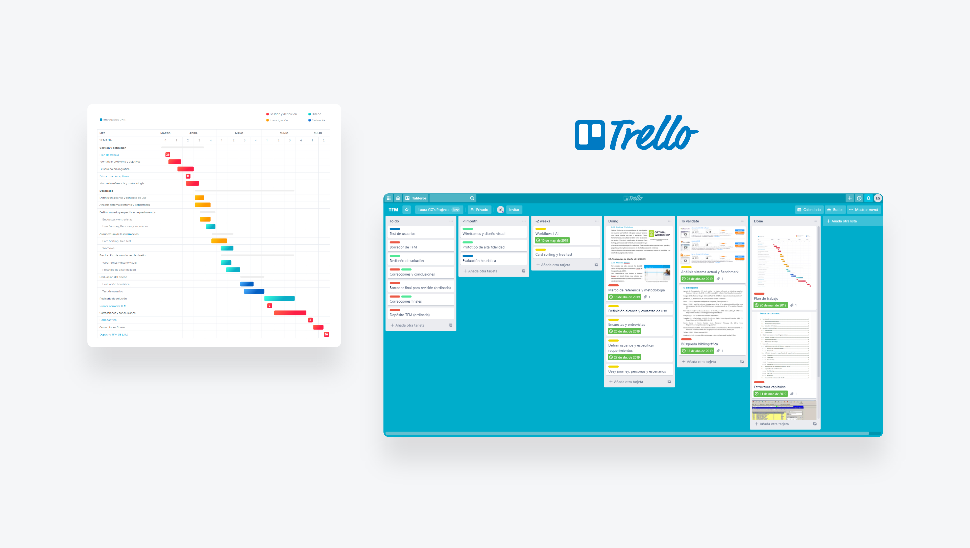
I made a graph similar to a Gantt chart. The easy and comfortable visualization of the tasks allowed me to control the progress at each stage of the project.
I used Kanban methodology (Agile) to control the work progress. Based on incremental development and dividing the work into parts. Using visual cards really helped me prioritize tasks and get things done.
02.-
Methodology
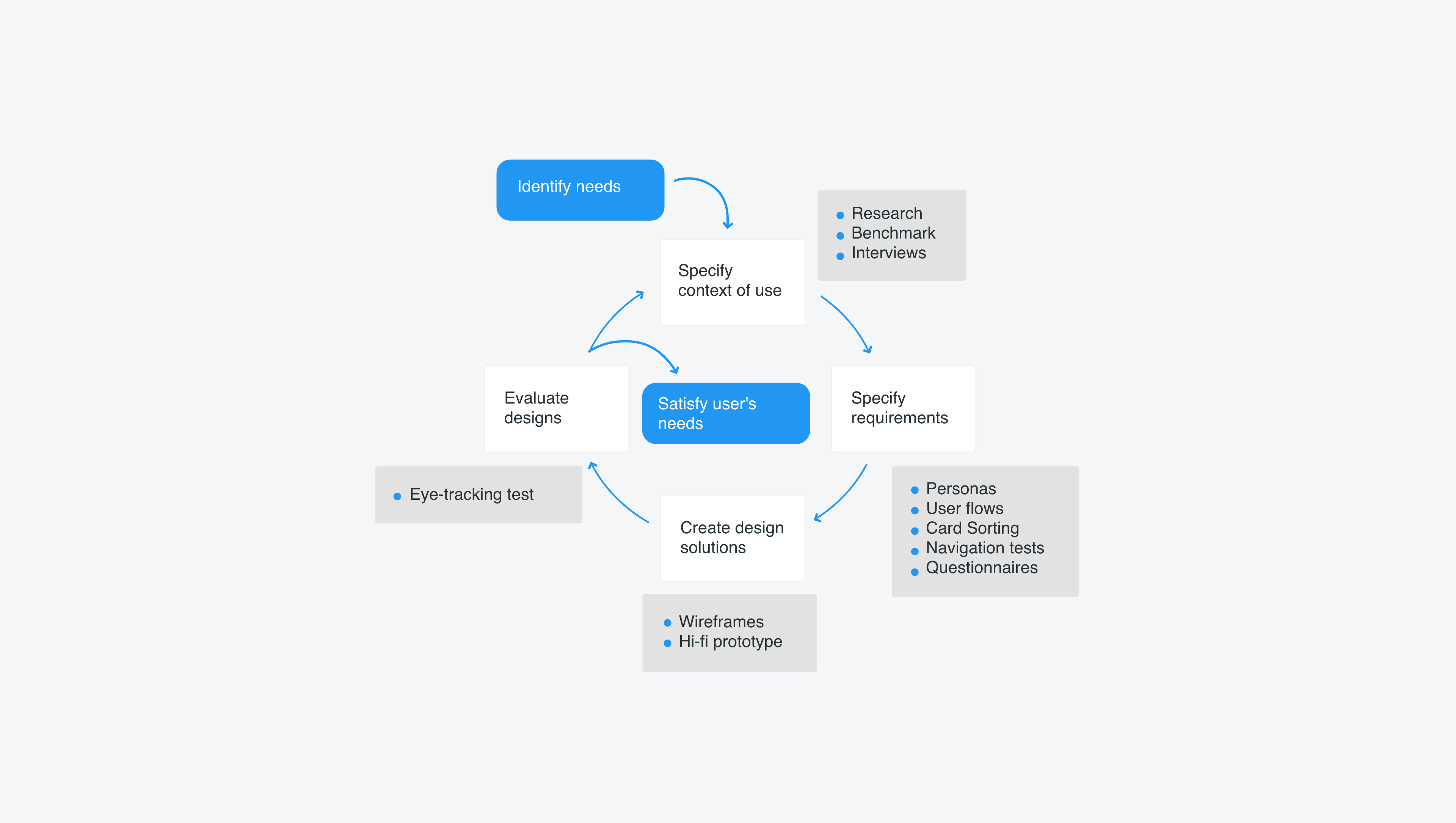
User Centered Design
The iterative process of UCD, trying to focus on the users and their needs in each phase of the design process and research techniques helped me create a usable and accessible product for them.
03.-
Analysis and comparison
Benchmark
The four most used (and best rated amongst different countries) medical software were chosen. I compared and analysed the characteristics of each competitor (aesthetics, technical support, ease of entering patient data, ease of use and learning, etc.).
These software demonstrated that the chosen features were essential to be able to compete in this market and be useful to the real users: healthcare professionals.
This benchmark was really useful because I found that there weren't many medical software specialized in sports medicine, and despite it requiring extra effort, because it means having to create something from scratch with little experience, it also resulted in an important market opportunity, and a personal challenge.
04.-
User definition and requirement specifications
User groups
The potential users of this application are the health and administrative staff of a Sports Medicine Unit. These can be categorized as different users as they do not all have the same role or permissions within the application. We can identify 3 types of potential user for this application: medical, nursing and management professionals.
04.-
User definition and requirement specifications
Interviews
To identify the needs and demands of Sports Medicine Unit workers, I carried out interviews as a qualitive analysis technique.
I was able to interview 3 individuals for of each group of users, and thus I obtained diverse opinions on each topic.
The interviews revealed that most users had a low computer level, and that they would like to have a unified and online application to carry out their work more easily (currently using 2 or more software, and paper). They proposed improvements that allowed me to optimize the prototype to their requirements, such as having a clearer and more organized application structure.
04.-
User definition and requirement specifications
Personas and Scenarios
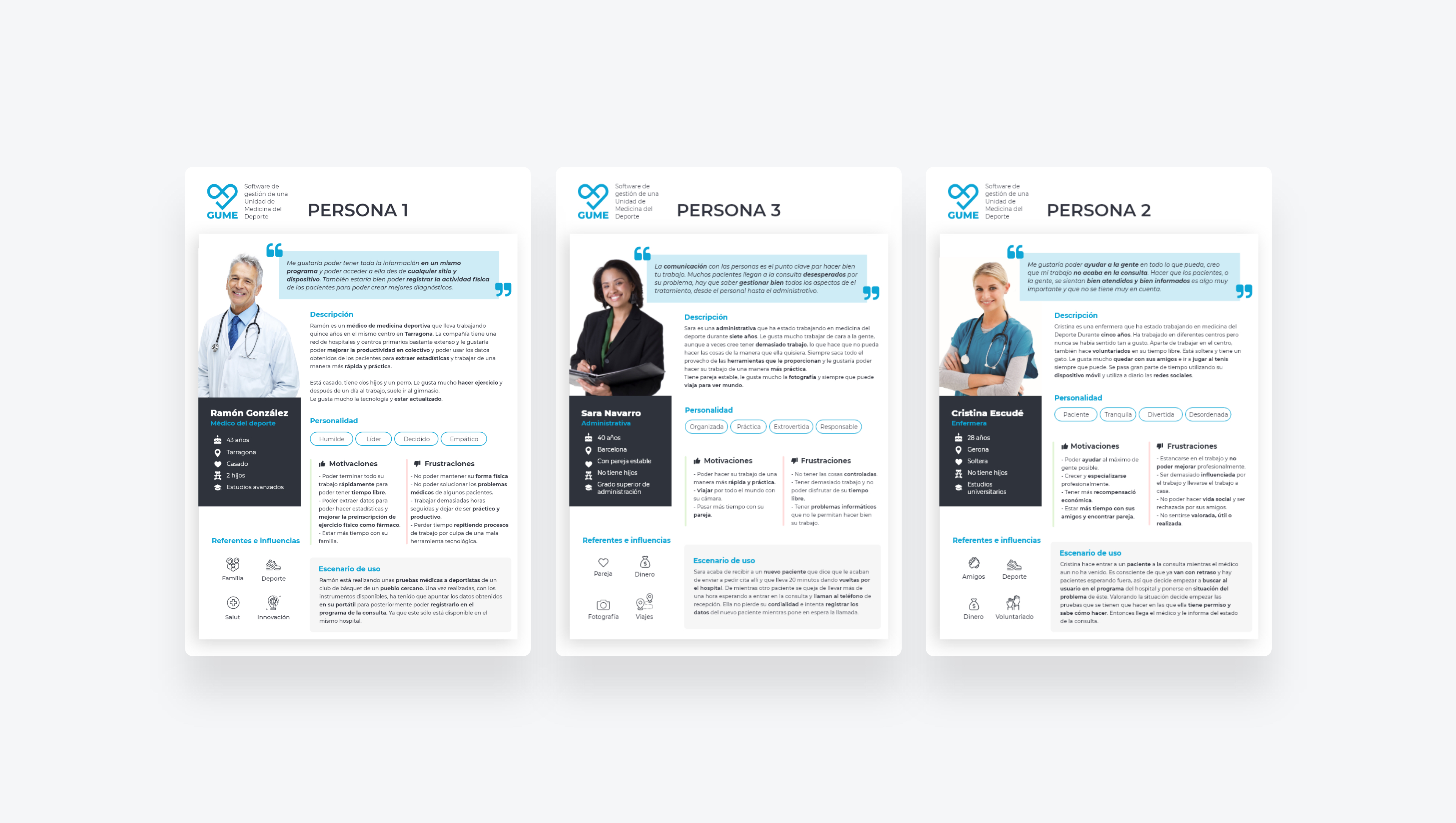
Once I had the necessary information from the real users, I made archetypal users to guide me throughout the design process.
I collected information on the behaviour patterns and key characteristics: attitudes, aptitudes, objectives, work environments, tools they use, challenges to overcome, motivations, etc.
A brief scenario was included describing each user in a situation where they interacted with the product, which helped me discover various users needs that were not yet specified.
05.-
Information architecture
Card Sorting
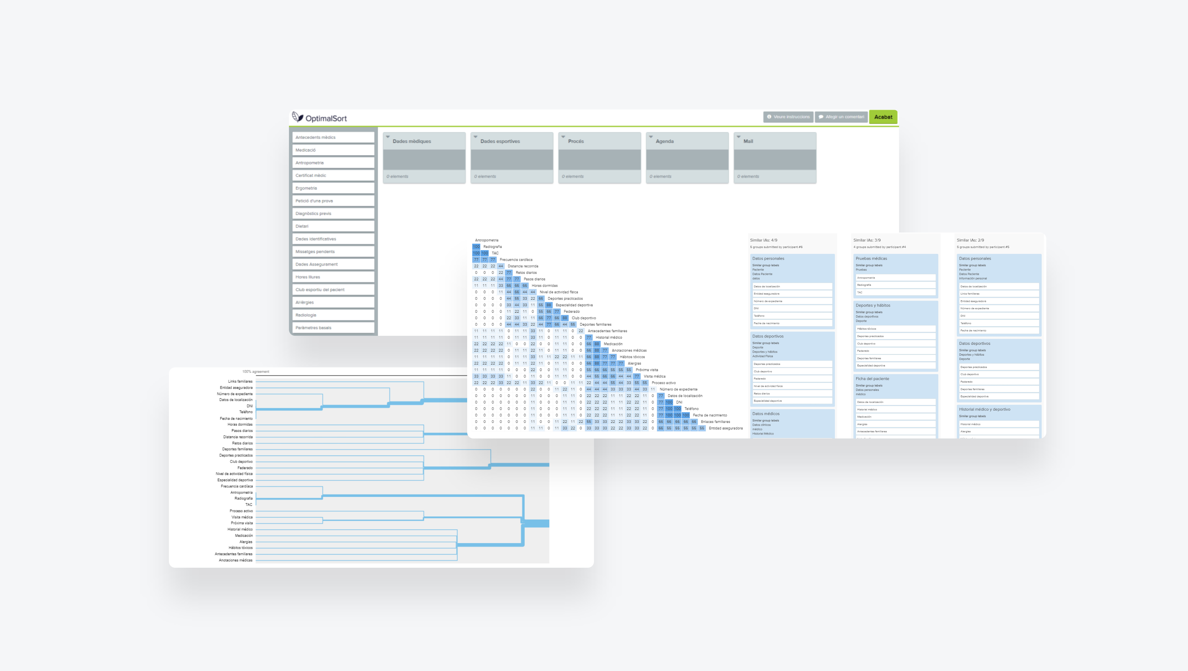
I carried out Card Sorting to explore how people group information into categories and how concepts are related to each other. It helped me define the information architecture of the product and identify terminology. This technique is fast, cheap and very reliable, so, why not use it? It allowed me to figure out the mental model of the participants and validate if it corresponded to my design.
Methodology
I asked the participants, individually, to classify a set of cards. I used an Open Card Sort, where participants could add new cards or write blank cards, to discover new categories, terms or organizational schemes.
Tool used
I used Optimal Workshop. I consider this software very useful because it automatically registers the order of each user, performs the analysis and can be used remotely.
Number of participants
9 participants, 3 from each user profile.
Quantitative analysis
The first analysis I performed on the data was a cluster analysis, which Optimal Workshop automatically provides for you, to observe the relationships between groups of categories. After applying the clustering algorithm, a dendogram was obtained and is shown below.
Using a similarity matrix, I counted the concurrences between categories.
Finally, the PCA (Participant Centered Analysis) analysis showed the 3 most popular completed card rankings based on how often two cards were matched in the same category.
Results
We finally obtained 4 clearly differentiated groups. I divided them into: Personal data, Physical activity, Medical data and Sports data.
Conclusions
Card Sorting is a very useful UCD tool for information architects and it allows users to collaborate when improving on a product.
Having done the test remotely and not being able to see or hear the participants, a lot of qualitative information was lost, since it was not possible to measure which cards took longer to sort and thus which cards presented the most doubts. However, on the other hand I gained lot of time, as I didn't have to manually analyse the results, which would have had an impact on resources and money in a real case.
05.-
Information architecture
Navigation test
Once the architecture was clear I had to distribute the information based on how they would appear on screen and decide what expressions to use. Once decided, I did a navigation test to check whether everything was in order and that there were no problems.
I carried out 3 separate tests, one for each type of user, since not all users would perform the same roles. Each had been asked for 3 specific tasks, specifically complex tasks or tasks that would cause conflicts.
Conclusions
The highest error percentage was found due to users not understanding the test itself, however their understanding of the distribution and expresions was positive so I applied it to the prototype.
To help users in future, the features that caused most doubts had an informative label added indicating their function.
05.-
Information architecture
Workflows and Sitemap
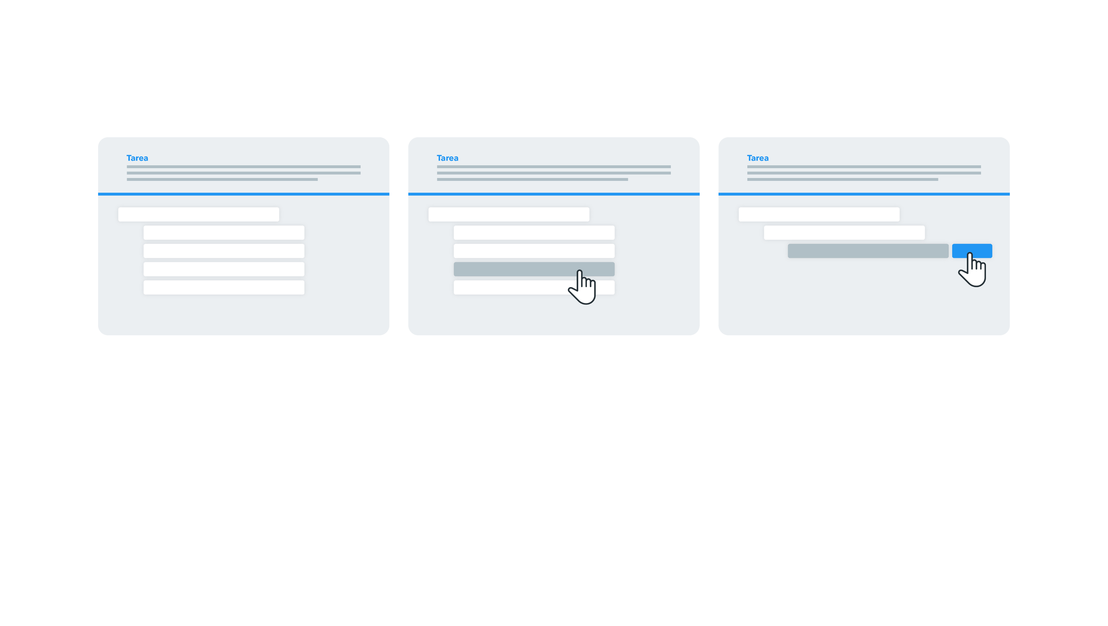
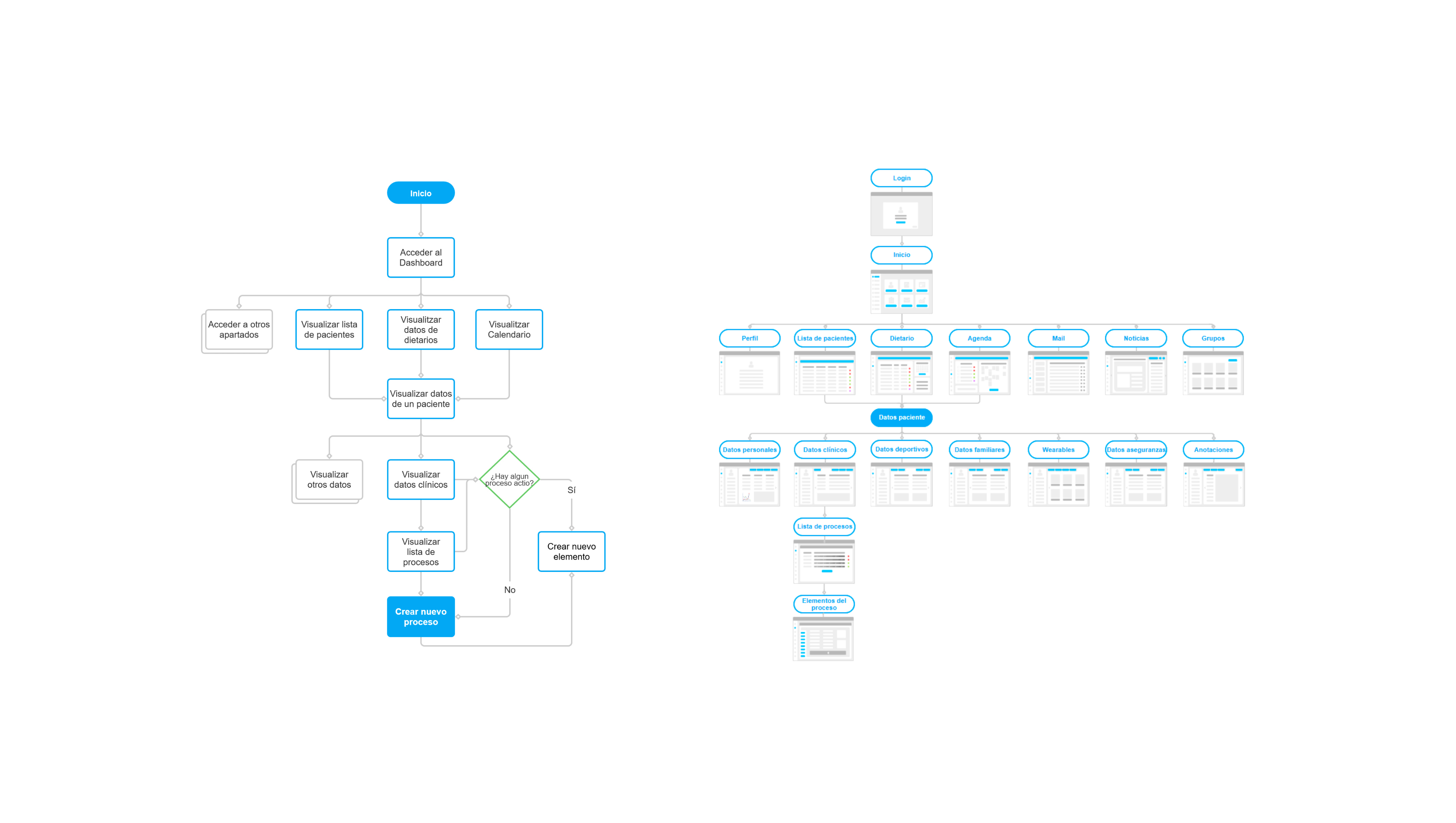
In order to more easily understand some of the more complex tasks, I created task flows, like the one shown below.
I also created a sitemap to quickly visualize the hierarchy of information. I created simple wireframes with Illustrator to show the different screens in a minimalistic way, which helped me start organizing my ideas on how to do the sketches.
06.-
Design solutions
Sketches
I decided to wireframe my project on paper using sketches. In my case, there was no development team to communicate the results of the sketches to, but I was able to show it to those interested at Sports Medicine Units, so that they could give their feedback regarding the proposed organization.
Sketches allowed me to discard design aspects in very early stages and the main advantages being that they are fast, cheap and easily disposable.
Some of the participants in the meeting, were initially reluctant to change, the program was very different from what they were used to. People do not like change, they don't want to modify their way of working, or living. But in the end, when I showed them the final prototype, with the aesthetics already implemented, they were amazed.
06.-
Design solutions
User Interface (UI) and Hi-fi prototype
I looked for visual references and inspiration on Dribbble, Pinterest, Behance and Instagram to decide the visual aesthetics of the application. I finally decided to use Google's Material Design as a guide and UI reference.
The prototype was made using Axure RP. I can't explain a lot a about the design of the software because it is a project that I would like to continue developing, but I'll show some screenshots below.
07.-
Design evaluation
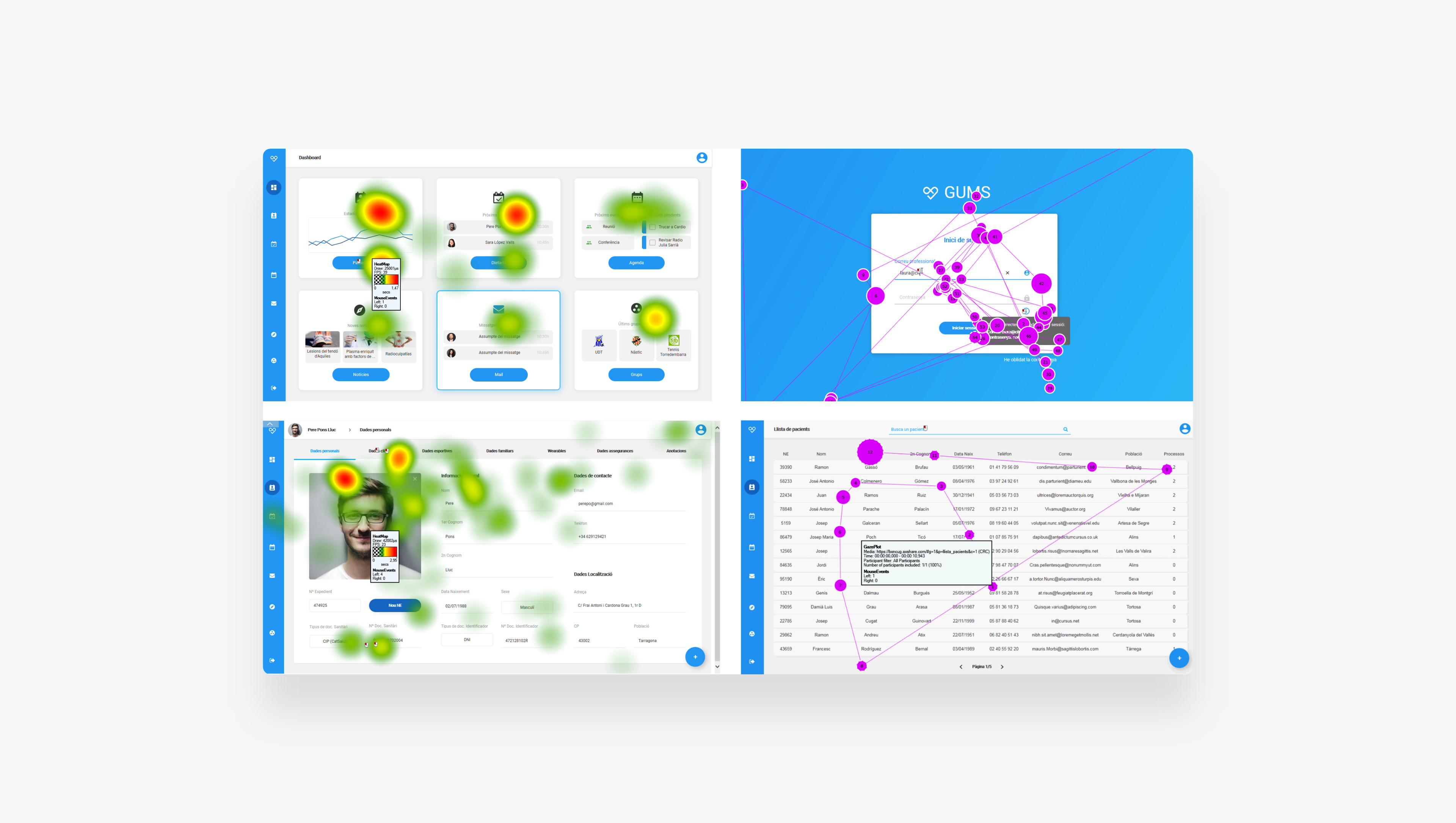
Eye-tracking
I carried out an Eye-tracking test to identify usability problems in the high visual fidelity prototype. I found problems related to graphic design and the artistic components, aspects related to the layout and location of navigation objects and content in the interface, visual appearance of objects and texts, etc.
Being able to see where users looked when they were doing a certain task allowed me to obtain information about visual attention: where they stopped, what attracted them most and their ability to find information.
Number of participants
6 people participated in this test, 2 of each type of user.
Test analysis
I used heat maps and gaze plots to analyse the data collected. The program created these visualizations automatically, but for their proper and effective use, you need to have an understanding of the research objectives.
Results
Most users successfully completed the tasks, some faster than others. Since it was the first time they saw the software, they had to take a first look at the entire screen in order to recognize the elements to interact with them. During the performance of the different tasks, the fluidity while browsing the application increased.
Thanks to this test, design errors were detected, and later modified to improve the user experience of the application.
Outcomes & Lessons learned
The main objective was accomplished which was the development of an advanced data management system prototype for a Sports Medicine Unit.
Having self-learned for so many hours, I obtained a lot of knowledge related to project management, User Research, User Centered Design and rapid prototyping with Axure.
The acceptance and positive evaluation of the design and prototype was really satisfying because for the first time, the final product was valued by a real client.
Finally, as a result of the design process and applied UCD techniques, we can confirm that the usability improved and the software generated a satisfactory user experience.
My partner
Developer of the project
Juan M Vergara
Senior Software Engineer